Building a Wallboard
Realtime Wallboards allow you to see the activity of your groups/skills and agents in Realtime, without a refresh rate. This is done by a series of widgets that you can customize to reflect your specific needs. The wallboards provide you the option to build your own wallboard from the ground up, or you can use a pre-built wallboard template provided to you upon accessing the wallboards.
Additional Helpful Realtime Wallboard ArticlesUsing Wallboard Templates
How to Modify an Existing Wallboard
Sharing Wallboards in CCAC
Tutorial Video - Creating a Wallboard
The video below will give you an overview of how to get started building a custom wallboard
Building a Wallboard
Building your own wallboard can seem overwhelming, but is not super difficult. To build your wallboard:
- Hover over the Realtime Icon on the sidebar menu
- Select Realtime Wallboards
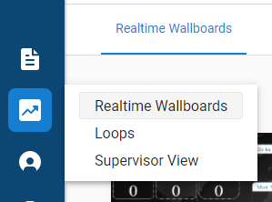
If any exist, a window of the existing wallboards will appear. You can either select an existing wallboard, or select to create a new wallboard.
To build your own, start by selecting the "New Wallboard" option in the top right hand corner.
Using a Wallboard Template
Pre-built wallboard templates save you time and effort by providing an existing stylish wallboard with pre-set widgets and metrics.
After selecting "New Wallboard" in the step above, you'll be presented with a batch of predefined templates.
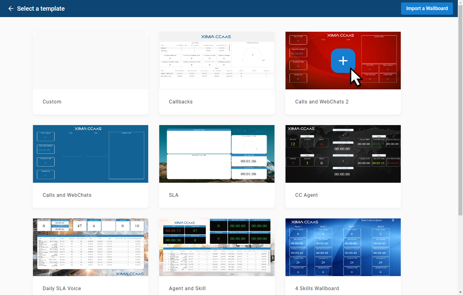
Hover over the desired wallboard template, then click on the "plus sign" in the middle.
Once you select the desired wallboard template, it will open and you will be presented the wallboard "Template Configuration" window.
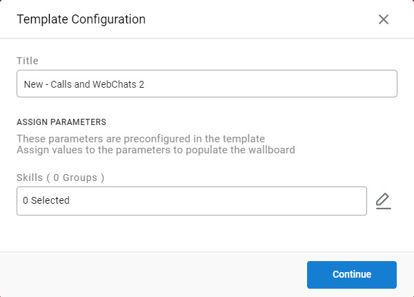
Depending on the selected template, you will now select which group(s)/skill(s) and Contact Center agents you would like to have monitored on the wallboard.
Select your desired group(s)/skill(s) and Contact Center Agents (if applicable), then select "Continue".
Your completed wallboard will now be displayed.
Wallboard Parameters
You will be presented with an option to edit the wallboard parameters. It is recommended that you first give the wallboard a title of your choosing.
There are two main changes that can be made; background color or background image. When creating a wallboard, it is not required to build a background, however, you are welcome to be as creative as you'd like. If you prefer to have a background color/image in your wallboard, select the "Background Color" or the "Background Image" options.
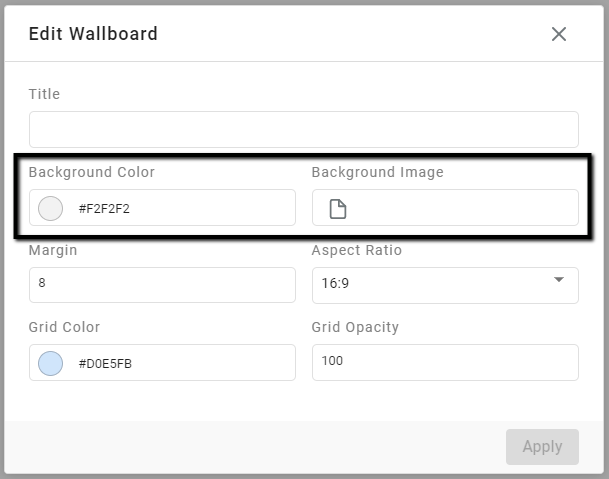
- If changing the background color, select the background color option (the circle to the left of the number) and select your color. Or, if you know the desired color code, enter it and hit "Apply."
- If adding a background image, select the "Background Image" option. You will then be allowed to find the image from your computer. Select your image, then hit "Apply."
Selecting Widgets
As you create your wallboard, you can let the creativity flow. You will have the ability to select your preference of widget from the list of Realtime Widgets listed on the right hand side of the screen.
Once the desired widget is selected, the widget will appear on the wallboard, and will be ready to configure.
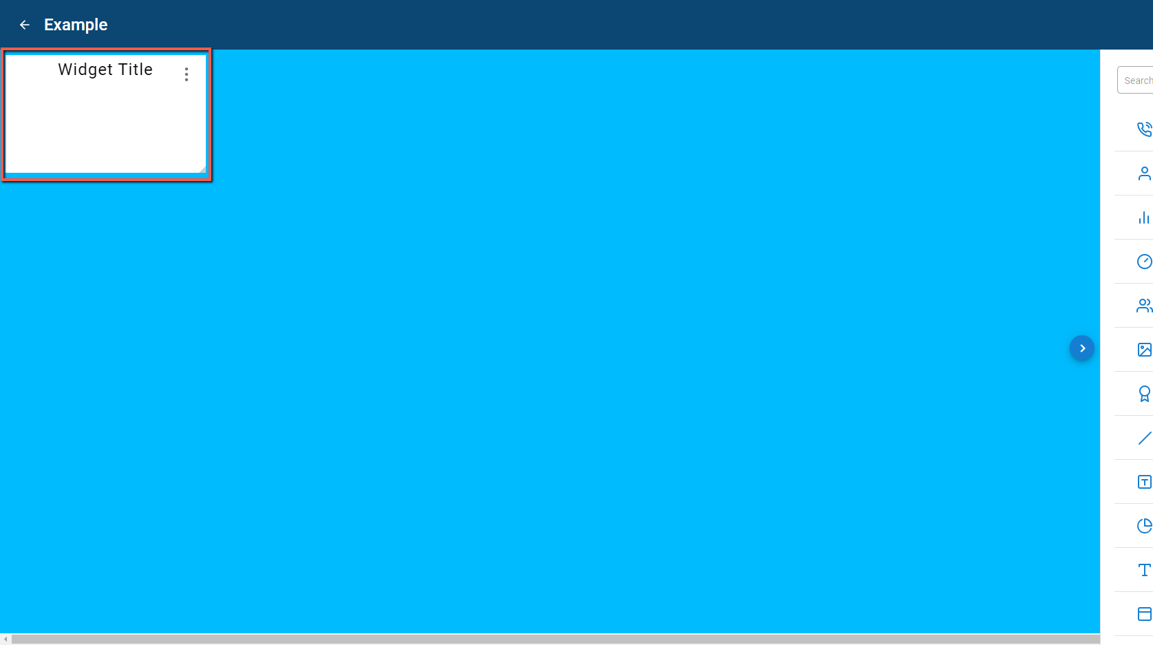
Configuring Widgets
To configure a widget:
- Click on the placed widget and select the vertical ellipses in the top right corner of the widget.
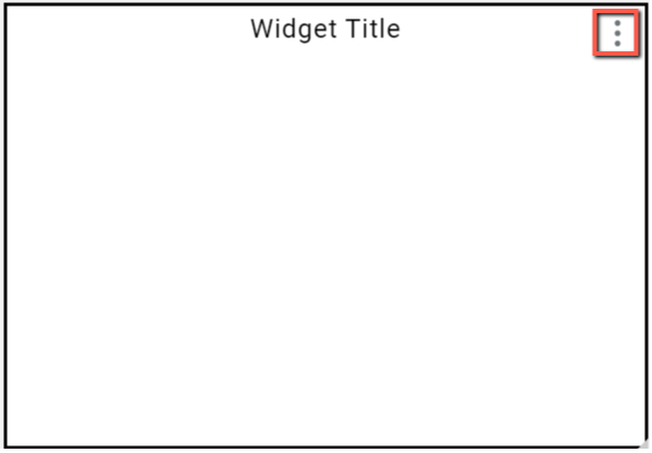
Upon selecting the icon you will be presented with four options.
- Go To Data - This is where you can select and configure the desired Realtime value.
- Go to Design - This is where you can design the look of the widget (font size/color, borders, colors, etc.).
3, Duplicate - This will make a copy of the existing widget. You can then edit the duplicate to your liking - Delete - If you would like to remove the widget, select this option.
Go To Data
Upon selecting "Go To Data" a window will open up on the right hand side of the screen. This window will provide the parameters for the widget. The parameters are essentially questions that you will answer to configure the widget. The parameters will vary, depending on the widget selected.
In the steps below, we are using the Title Value Widget as an example
Example Title Value Widget Configuration
Start by selecting the Title Value Widget from the list of widget options on the right hand side of your screen. The widget will now appear, and you can begin configuration.
-
Select the "three dot" icon in the top right hand corner of the widget.
-
Select "Go To Data."
-
On the right hand side of the screen you will see a window appear that has two options: Data and Design. Select Data.
-
Name your widget - This is typically named based on the value it will represent. Furthermore, the name can be changed later. For example: If this widget will be monitoring the number of calls in the queue for the customer service group, you might name it "Customer Service Queue".
-
Select the box that says "Select Metric." A dropdown list of items will be presented.
You will be able to search for values in one of two ways. First, you can scroll through the list, which is alphabetical ascending A to Z. Second, as in the example below, you can type in the desired value. The list will then narrow down to the list of value options that fit, or closely resemble the metric entered.
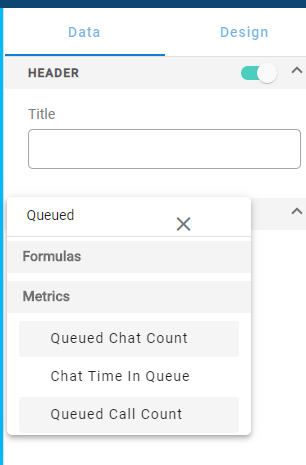
- Select the desired value. For this example, we will select "Queued Call Count"
- Upon selecting the desired value, a "properties" window will appear. You can now scroll through and select the desired properties for the value.
- Title - If desired, you can give the value a title
- Time Frame - You will have three options to choose from when selecting your time frame
- Now - This is a live count. For example, if you looking at Calls in Queue, by selecting "Now" this metric will display how many calls are waiting in the queue right now.
- Since - This is a count since a specific time. For example, if your agents log in and start taking calls at 8:00 am, set your "Since" time as 8:00 am. This will then display how many calls have been in the queue since 8:00 am.
- Last - This a count in the Last "x" amount of time. For example, if you wanted to see how many calls have been in the queue in the last two hours, select "Last", and set it at 02:00:00.
- Calculation - This option will vary for each metric.
For example, if you desire to see a count of calls in queue you will have the following options for Calculation:
-
Count - Shows the total count of the selected metric
-
Duration - Shows the total overall duration for the selected duration metric
-
Max Duration - Shows the maximum (longest) duration of the selected metric
-
Min Duration - Shows the minimum (shortest) duration of the selected metric
-
Average Duration - Shows the average duration of the selected metric
-
Median Duration - Shows the median duration of the selected metric
-
Criteria - This will also be dependent on the specific metric selected. Some will have more options than others. For example, if you desire to see a total count of calls in queue for a specific group/skill, select the "+" next to "Criteria". A "Select Criteria" box will now be available and you will see a list of applicable criteria options.
Select the option that you would like to use. In this scenario, we would select "Group."
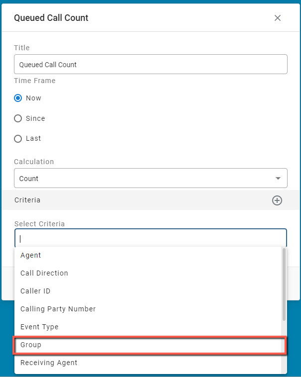
A "Group" section will now present. Select the pencil tool to the right, and select the desired group(s)/skill(s), then select "Apply."
Go to Design
In addition to configuring the widget, you will also have the option to "design" the widget. This provides the ability to alter the way the widget looks through font style/color, as well as widget background colors and borders, etc.
To design widget:
- Click on the placed widget and select the "three dots" icon.
- Select "Go To Design."
- A window will appear on the right hand side of the screen. From here you can select the desired changes that you would like to make.
Widget design options will pertain to the specified widget, however, each will have the default options to change design for the following areas:
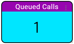
- Header - This is where the name of the value is displayed.
- Metric - This is the actual value.
- Container - This pertains to items such as background and borders.
- Upon finishing your desired design for the widget, in the bottom right hand corner, click "Apply."
Once you have completed the design of your new wallboard, select the "Save and Exit" option in the top right-hand corner of your screen.
Displaying Wallboard
Upon finishing your wallboard, you can display your wallboard easily. Simply go to the desired finished wallboard you would like to display, and click on the vertical ellipses.
Then, select "Open," and your wallboard will be presented. If you would like to make it full screen, select the "Full Screen" button up in the top right hand corner.
To exit full screen, simply hit the "Esc" key on the keyboard.
Updated about 1 month ago
